

Introduction
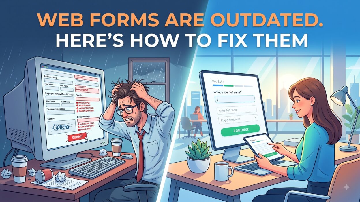
TL;DR Most web forms still look and behave like they did fifteen years ago. Long fields. Confusing labels. No feedback until a red error message appears. Users expect more today. Web forms need a real update, not a small patch. This guide breaks down why web forms feel broken and shows the exact steps you can take to fix them, field by field.
Table of Contents
Why Web Forms Feel Outdated Today
Web forms used to sit alone as the only way to collect information online. That’s no longer true. Apps, chat tools, and voice assistants now handle tasks that once required a form. Users compare every web form against these faster, smoother tools.
This comparison happens without users even realizing it. A person orders food through an app in under a minute, then opens a web form that asks for the same address three separate times. The contrast feels jarring, even if the user never names the exact reason a form feels slow.
Old web forms ask for too much upfront. A checkout page asks for a phone number, a company name, and a fax number nobody uses anymore. Every extra field adds friction. Friction pushes users away before they finish. Each additional field also adds a small chance of a typo, which creates even more frustration down the line.
Design habits also stayed frozen in place. Many web forms still use tiny text, gray placeholder text that vanishes on click, and error messages that appear only after a full page reload. These habits made sense years ago. They frustrate users now.
The Problem With Long Web Forms
Long web forms test a user’s patience. A form with twenty fields feels like a chore, not a quick task. Users scan the length of a form before they even start typing. A long form scares off half your potential leads before the first keystroke.
Research from the Baymard Institute shows checkout forms with too many fields cause a huge share of cart abandonment. Shorter web forms convert better every time researchers test this directly.
How User Expectations Changed
Mobile apps trained users to expect instant feedback. A wrong password shows an error the moment you type it, not after you submit the whole screen. Web forms that still wait until submission to flag an error feel slow and dated by comparison.
Users also expect forms to remember them. Autofill, saved payment details, and pre-filled fields all raise the bar. A web form that ignores these expectations loses trust fast, even if the product behind it is strong.
The Real Cost of Bad Web Forms
A broken web form costs real revenue. Every abandoned form represents a lost lead, a lost sale, or a lost signup. Companies rarely track this loss closely enough, so the damage stays hidden inside vague bounce rate numbers.
Marketing teams spend real money to bring a visitor to a landing page. A clunky web form wastes that spend the second a visitor gives up halfway through. Fixing web forms often produces a faster return than any new ad campaign.
Lost Leads and Abandoned Carts
E-commerce sites lose a huge share of potential orders to abandoned checkout forms. A shopper adds an item to the cart, then quits during a confusing address field or a required account creation step. Simpler web forms recover much of this lost revenue.
B2B companies face the same problem with demo request forms. A prospect fills out three fields, hits a fourth confusing one, and closes the tab. That lost lead never comes back through the same channel again.
Damage to Brand Trust
A messy web form signals a careless company. Users judge a whole brand based on small details like form design. A confusing checkout form makes a shopper question whether their payment information is even safe.
Trust builds slowly and breaks fast. One bad experience with a web form can push a user toward a competitor with a smoother process, even if your product is better overall.
Signs Your Web Forms Need a Fix
Some warning signs show up clearly in analytics. Other signs hide inside user complaints or support tickets. A regular review of your web forms catches both types before they cost you too many conversions.
Check your form analytics tool for drop-off points. Most modern form builders show exactly which field causes users to quit. This single report often reveals the fastest fix available for your entire funnel.
Talk to real users, too. Analytics show where people quit, but a short interview reveals why. Five minutes with a frustrated user often uncovers a fix that months of guessing would never find on its own.
High Abandonment Rates
A high abandonment rate on any web form points to a real problem. Compare your rate against industry benchmarks. A rate above sixty percent on a short form usually means something inside the form actively pushes users away.
Confusing Field Labels
Vague labels like “Details” or “Info” confuse users about what to type. Clear, specific labels remove guesswork. A field labeled “Work Email” performs far better than one simply labeled “Email” on a B2B web form. Specific labels remove doubt and speed up how fast a user moves through each field without stopping to guess.
1. Cut Down the Number of Fields
Every field on a web form needs to earn its place. Before you add a new field, ask if you truly need that data right now. Many teams collect extra data out of habit, not real business need.
Start by listing every field on your current web form. Mark each one as required, optional, or unnecessary. Delete the unnecessary fields first. Move optional fields to a later stage in the user journey if possible.
Combine Related Fields Where You Can
A field for first name and a separate field for last name can often merge into one full name field for simple forms. Combining related fields shortens a web form without losing any real data.
Ask for Less on the First Interaction
A newsletter signup only needs an email address. Save deeper questions, like job title or company size, for a later stage once trust builds. This staged approach keeps early web forms light and fast.
2. Use Smart Autofill and Autocomplete
Modern browsers already store user data like addresses and payment details. Web forms that block or ignore autofill waste this built-in convenience and slow users down for no reason.
Use standard HTML autocomplete attributes on every relevant field. This small code change lets browsers fill in known details instantly. A user who taps one button instead of typing eight fields finishes your form far faster.
Add Address Lookup Tools
Address autocomplete tools let users type a few letters and pick their full address from a dropdown. This feature cuts typing time and reduces address errors on delivery forms and checkout pages.
Support Password Managers
Many users rely on password managers to fill login and signup fields. Avoid custom scripts that block this behavior. Web forms that fight password managers frustrate security-conscious users the most.
3. Add Real-Time Validation
Waiting until submission to show an error wastes a user’s time. Real-time validation checks each field as the user types or moves to the next one. This instant feedback prevents a wall of errors at the very end.
Show a small green check next to a correctly filled field. Show a clear, specific message next to an incorrect one. A message like “Enter a valid email address” helps more than a plain “Invalid input” alert.
Validate Formats as Users Type
Phone numbers, emails, and postal codes all follow clear patterns. Validate these formats live as a user types. Early feedback stops small mistakes from turning into a frustrating resubmission cycle.
Keep Error Messages Specific and Kind
A harsh error message feels like a scolding. Write messages in a calm, helpful tone. Tell users exactly what to fix instead of simply flagging that something went wrong.
4. Break Long Web Forms into Steps
A single long page overwhelms users right away. Multi-step web forms break a big task into smaller, manageable pieces. Each step feels quick and users stay motivated to reach the end.
Group related fields into logical steps. Personal details in step one. Address details in step two. Payment details in step three. This structure matches how users naturally think through a task.
Show a Clear Progress Bar
A progress bar tells users exactly how much work remains. This visual cue reduces drop-off because users can see the finish line instead of guessing how long a form will take.
Save Progress Automatically
Users sometimes get interrupted mid-form by a phone call or a closed tab. Auto-save features let them pick up where they left off. This small safety net prevents lost work and repeated frustration.
5. Make Web Forms Mobile Friendly
More than half of web traffic now comes from phones. A web form that only works well on desktop loses a massive share of potential users right from the start.
Use large touch targets for every button and field. Small checkboxes and tiny dropdown arrows frustrate thumbs on a small screen. Test every form on a real phone, not just a resized browser window.
Use the Right Keyboard for Each Field
Mobile browsers can trigger a numeric keyboard for phone fields and an email keyboard with an at symbol for email fields. This small detail speeds up typing and cuts mistakes on mobile web forms.
Avoid Tiny Text and Cramped Spacing
Cramped fields cause mistaken taps and typos. Give every field enough space to breathe. Larger text also helps older users and anyone browsing in bright sunlight on a phone screen.
6. Use Conditional Logic
Not every user needs every field. Conditional logic shows or hides fields based on earlier answers. This approach keeps web forms short for each individual user, even if the full form covers many scenarios.
A shipping form might only show a company name field if the user selects “business” instead of “personal.” This logic removes irrelevant clutter and speeds up the whole experience.
Route Users Based on Their Answers
A support form can route users to different follow-up questions based on their issue type. This branching keeps each path short and relevant, instead of forcing everyone through the same generic set of fields.
Hide Fields That Rarely Apply
Fields like “Company Website” only matter for business users. Hide these fields by default and reveal them only when relevant. Fewer visible fields make a web form feel far less intimidating.
7. Improve Visual Design and Layout
A cluttered layout confuses users before they even read a single label. Clean spacing, clear hierarchy, and consistent styling all help a web form feel simple and approachable.
Stick to a single column layout whenever possible. Multi-column forms confuse the natural top-to-bottom reading flow and slow users down, especially on mobile screens.
Use Consistent Button Styles
A submit button should stand out clearly from other buttons on the page. Use one strong color for the primary action. Consistent button styles across every web form build familiarity and trust over time.
Add White Space Around Fields
Cramped fields feel stressful to fill out. Generous white space around each field gives users room to focus. This small design choice makes a long form feel shorter than it actually is.
8. Add Progress Indicators and Micro-Feedback
Small feedback moments keep users engaged through a longer web form. A subtle animation after a correct entry or a small counter showing “3 of 5 fields complete” gives users a sense of momentum.
These micro-interactions cost little to build but change how a form feels. Users stick with tasks longer when they can see clear signs of progress along the way.
Celebrate Successful Submission
A plain “Thank you” page feels flat. Add a short, warm confirmation message and a clear next step. This final moment shapes how users remember the entire web form experience.
Use Loading States During Submission
A frozen screen after clicking submit makes users nervous. Show a simple loading spinner or progress message. This small detail reassures users that the form is actually working in the background.
Common Mistakes That Keep Web Forms Outdated
Many teams redesign the visual style of a web form but skip the deeper structural fixes. A form can look modern and still ask for too much information or hide error messages until the end.
Another common mistake involves ignoring accessibility. Web forms without proper labels or keyboard navigation shut out users with disabilities entirely. Screen reader support and clear focus states matter just as much as visual polish.
Some teams also forget to test their web forms on real users. Internal teams already know how a form works, so they miss confusing spots that a fresh visitor would notice immediately. Regular user testing catches problems no internal review ever will.
Finally, many companies build a web form once and never revisit it. User expectations shift every year. A form that felt modern three years ago can feel outdated today without a single line of code changing around it.
Best Practices for Long-Term Web Form Success
Treat every web form as a living part of your product, not a one-time build. Review performance data every quarter. Look for new drop-off points as your audience and traffic sources change over time.
Run small A/B tests before big redesigns. Test one field change or one layout tweak at a time. This approach shows exactly what improves conversion instead of guessing which change made the difference.
Keep accessibility part of every review. Check color contrast, label clarity, and keyboard navigation on every web form update. Accessible forms perform better for every user, not just those who rely on assistive tools.
Document your form standards in a shared style guide. Teams that follow one clear standard build consistent web forms across the whole company, which builds trust with users who interact with more than one form on your site.
Frequently Asked Questions
Why do web forms feel outdated compared to apps?
Web forms feel outdated because many still lack real-time feedback, smart autofill, and mobile-friendly design. Apps set a higher bar for speed and convenience, so older web forms feel slow by comparison.
How many fields should a web form have?
A web form should include only the fields your team truly needs right now. Most high-performing forms stay under seven fields for the first interaction and save extra questions for later stages.
What causes high abandonment on web forms?
Long field counts, confusing labels, poor mobile design, and slow error feedback all cause high abandonment on web forms. Fixing even one of these issues often improves completion rates noticeably.
Are multi-step web forms better than single-page forms?
Multi-step web forms often perform better for longer processes because they break work into small, manageable pieces. Short forms with only a few fields usually work fine as a single page.
How often should a company update its web forms?
A company should review its web forms every few months and run a deeper redesign at least once a year. User expectations and mobile behavior both shift quickly, so regular reviews keep forms current.
Do web forms affect SEO and site performance?
Yes, slow or bulky web forms can hurt page speed, which affects search rankings. Clean, lightweight form code also improves overall site performance and keeps bounce rates lower across the board.
Should every web form include a CAPTCHA?
Not every web form needs a CAPTCHA. Add one only on forms that face real spam problems, since a CAPTCHA adds friction and can lower completion rates on low-risk forms like simple contact pages.
Read More:-What Is Sales and Marketing Automation?
Conclusion

Old habits keep most web forms stuck in the past. Long fields, vague labels, and slow feedback all push users away before they finish a single task. A modern approach fixes this with fewer fields, real-time validation, and mobile-friendly design.
Start small if a full redesign feels like too much right now. Cut a few unnecessary fields. Add real-time validation to your most important form. Test the result on a real phone before you launch anything new.
Web forms will always sit at the center of how users sign up, check out, and reach out to your team. Companies that treat web forms as a priority, not an afterthought, turn a simple form into a real advantage over competitors who still leave users stuck on outdated fields.
Measure the impact after every change. Track completion rate, time to finish, and drop-off points before and after each fix. This habit turns web form updates from guesswork into a steady, reliable source of growth for the whole business.