
Introduction
TL;DR Every business wants more leads. Every marketer wants better results. Landing Page Conversion Rates decide how many visitors turn into paying customers. A high converting page saves money on ads. A low converting page wastes every dollar spent on traffic.
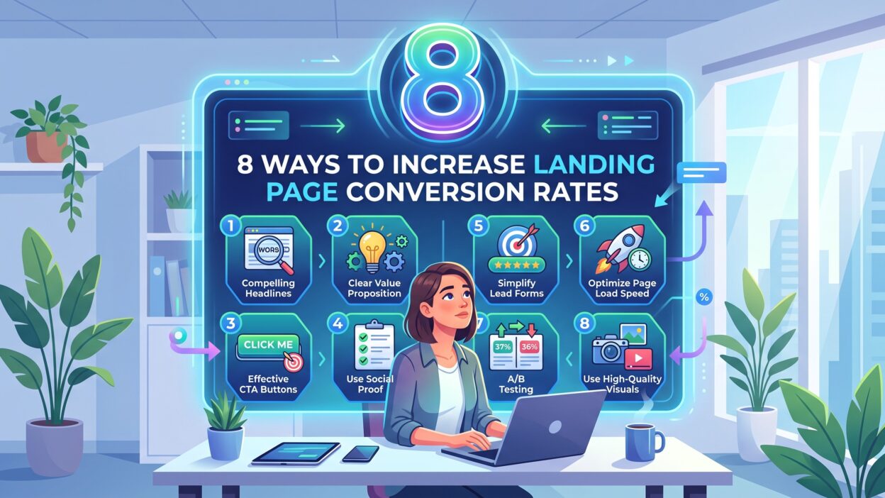
This guide covers eight proven ways to raise Landing Page Conversion Rates. Each method is practical. Each method works for small businesses and large brands alike. Read through each section and pick the tips that fit your page today.
Table of Contents
What Is a Landing Page Conversion Rate
Landing Page Conversion Rates measure the percentage of visitors who complete a specific goal. That goal can be a sign up. That goal can be a purchase. That goal can be a form submission or a download.
The formula stays simple. Take total conversions. Divide that number by total visitors. Multiply the result by 100 to get a percentage.
A good conversion rate depends on the industry and the offer. Most landing pages convert between 2% and 5%. Top performing pages hit 10% or higher. E-commerce pages often sit lower than lead generation pages because purchase decisions take more thought.
Understanding this number gives marketers a clear target. It helps teams track progress week by week. It also shows which changes actually move the needle and which ones waste time.
Many teams chase traffic first. Traffic matters, but conversion matters more. A page with 1,000 visitors and a 2% conversion rate brings 20 leads. Raise that rate to 6% and the same traffic brings 60 leads. No new ad spend required.
1. Write a Clear and Strong Headline
Your headline is the first thing a visitor reads. A weak headline kills interest within seconds. A strong headline builds curiosity right away and pulls the reader further down the page.
Keep the Message Simple
Use plain language in every headline. Avoid jargon and buzzwords. Tell visitors exactly what they get and why it matters to them.
Short words work better than long ones. A ten-word headline often beats a twenty-word headline. Visitors scan pages fast, and a busy headline loses their attention.
Match the Headline to the Ad
Visitors click ads with certain expectations. Your headline needs to match that promise word for word when possible. A mismatch creates doubt within the first two seconds.
This match builds instant trust. It also lowers bounce rate because visitors feel they landed in the right place.
Add a Benefit, Not Just a Feature
Features describe the product. Benefits describe the outcome. A headline about outcomes connects faster with real needs.
For example, “Cloud Storage With 256-bit Encryption” describes a feature. “Keep Your Files Safe From Anywhere” describes a benefit. The second version speaks to a real fear.
A strong headline sets the tone for the entire page. It directly shapes Landing Page Conversion Rates before a visitor even scrolls.
2. Simplify Your Call to Action
Your CTA button guides visitors toward the final action. A confusing CTA loses conversions fast. A clear CTA button boosts them without extra effort.
Use Strong Action Words
Words like “Get,” “Start,” and “Claim” work well across industries. These words create urgency. They tell visitors exactly what happens next after the click.
Avoid vague phrases like “Submit” or “Click Here.” These phrases sound flat. They give no reason to act now.
Limit the Page to One Primary CTA
Too many buttons confuse visitors and split their attention. Stick to one main action per landing page. Supporting links can exist, but the primary CTA should stand alone visually.
A page with five competing buttons feels scattered. A page with one clear button feels focused and easy to follow.
Make the Button Physically Stand Out
Use a color that contrasts with the rest of the page. Place the button above the fold so visitors see it without scrolling. Add white space around the button so nothing distracts from it.
Button size matters too. A tiny button gets ignored. A large, well-placed button draws the eye naturally.
A strong CTA strategy lifts Landing Page Conversion Rates in a measurable way, often within the first week of testing.
3. Use Trust Signals and Social Proof
People trust other people more than they trust brands. Reviews, testimonials, and badges build confidence within seconds of landing on a page.
Add Real Customer Reviews
Genuine reviews feel authentic and human. Include names, photos, and specific results when possible. Vague five-star ratings without context carry less weight.
A review that mentions a specific outcome works best. “This tool saved us ten hours a week” tells a clear story. A generic “Great product!” tells almost nothing.
Show Security and Payment Badges
Visitors worry about data safety, especially on checkout pages. Security badges ease that worry within a glance. Payment logos like Visa or PayPal add instant familiarity.
Place these badges near the CTA button. This placement removes doubt at the exact moment a visitor decides to act.
Display Client Logos and Media Mentions
Logos of known brands add instant credibility. This tactic works especially well for B2B landing pages. A row of recognizable logos tells visitors that others already trust the brand.
Media mentions carry similar weight. A small “As Seen In” section builds authority fast.
Trust signals reduce hesitation at the exact moment it matters most. They push visitors closer to the final click. This directly lifts Landing Page Conversion Rates across almost every industry tested.
4. Optimize Page Load Speed
Slow pages lose visitors within seconds. Every extra second of load time hurts results. A one-second delay can drop conversions by a noticeable margin.
Compress Every Image
Large images slow pages down more than almost any other factor. Compress every image without losing visible quality. Modern formats like WebP shrink file size while keeping images sharp.
Reduce Unnecessary Redirects
Each redirect adds extra load time behind the scenes. Remove redirects that serve no real purpose. Keep the path from click to page as short as possible.
Use a Content Delivery Network
A content delivery network stores copies of your page on servers around the world. Visitors load the page from a server near them. This setup speeds up load times for global audiences.
Minimize Heavy Scripts
Extra tracking scripts and plugins add weight to a page. Remove any script that no longer serves a purpose. A lighter page loads faster on every device.
Fast pages keep visitors engaged instead of frustrated. Engaged visitors convert far more often than impatient ones. Speed plays a massive role in Landing Page Conversion Rates, especially on mobile networks.
5. Reduce Form Fields
Long forms scare visitors away before they even start typing. Short forms feel easy. Easy feels fast, and fast feels worth the effort.
Ask Only for Essential Information
Name and email often cover the basics for most offers. Extra fields lower completion rates with every added box. Keep the form lean and only ask what the next step truly requires.
Phone numbers, company size, and job titles can wait for a later stage. Early forms should remove friction, not create it.
Use Multi-Step Forms for Complex Offers
Break long forms into smaller steps when more information is truly needed. This structure makes each step feel manageable. Visitors complete multi-step forms more often than one giant form.
Progress bars help too. A visible progress bar shows how close a visitor is to finishing.
Add Autofill and Smart Defaults
Autofill saves time for returning visitors and mobile users. People appreciate small conveniences like this. Convenience boosts form completion in a real, measurable way.
Shorter forms mean higher form completion rates across almost every test run. Higher completion rates translate directly into better Landing Page Conversion Rates.
6. Add High-Quality Visuals
Images and videos tell a story faster than text alone. Plain text blocks can feel boring after a few paragraphs. Strong visuals grab attention within the first glance.
Use Relevant Product or Service Images
Show the actual product or service in use. Avoid generic stock photos that feel disconnected from the offer. Authentic images build trust because they feel real.
A screenshot of the actual software beats a stock photo of people smiling at laptops. Visitors want proof, not decoration.
Add a Short Explainer Video
A short video explains value in under a minute. Videos increase the time visitors spend on the page. More time on page often signals deeper interest and higher trust.
Keep videos under ninety seconds when possible. Long videos lose attention fast, especially on mobile devices.
Optimize Every Visual for File Size
Large visuals slow pages down and hurt the speed gains covered earlier. Balance visual quality with fast load times. Both factors matter for conversions and should never work against each other.
Great visuals support the written message instead of replacing it. Strong visuals also improve Landing Page Conversion Rates over time, especially when paired with clear copy.
7. Run A/B Tests Regularly
Guessing wastes time and marketing budget. Testing gives real, measurable answers. Data beats opinions in almost every case.
Test One Element at a Time
Change only the headline in one test. Change only the CTA color in the next test. This isolation keeps results clear and easy to interpret.
Testing multiple elements at once muddies the data. A team cannot tell which change caused the shift in results.
Track Results Until They Reach Statistical Significance
Small sample sizes mislead teams into false conclusions. Wait until enough visitors see each version before calling a winner. Rushed decisions often reverse themselves later.
Most testing tools show a confidence score. Wait for that score to reach a reliable level before acting.
Apply Winning Variations Site-Wide
Once a test produces a clear winner, apply that change across similar pages. This step compounds small gains into large results over months.
Testing never truly ends. Consumer habits shift, and pages need fresh tests on a regular schedule. Consistent testing improves Landing Page Conversion Rates step by step, quarter after quarter.
8. Make Your Page Mobile Friendly
Most web traffic today comes from phones. A page that fails on mobile fails overall, no matter how well it performs on desktop.
Use Responsive Design
Responsive pages adjust smoothly to any screen size. Text stays readable. Buttons stay tappable. Images resize without breaking the layout.
Simplify Navigation for Small Screens
Mobile users want quick answers without extra taps. Remove clutter from the mobile version of the page. Keep menus minimal and keep the CTA visible near the top.
Test Every Button for Thumb Reach
Buttons should sit within easy reach of a thumb. Small buttons placed awkwardly frustrate users within seconds. Frustration leads straight to an exit, not a conversion.
Check Load Speed on Real Devices
Desktop speed tests can hide mobile problems. Test the page on an actual phone with average network speed. Real-world testing reveals issues that lab tests often miss.
Mobile optimization protects Landing Page Conversion Rates as traffic keeps shifting toward phones and tablets every year.
Common Mistakes That Hurt Landing Page Conversion Rates
Many pages fail because of small, avoidable mistakes. Cluttered layouts confuse visitors within the first few seconds. Weak headlines fail to grab attention before visitors scroll away.
Missing trust signals raise doubt at the exact moment a visitor considers acting. Slow load speed drives impatient visitors straight to a competitor. Long forms discourage sign ups before visitors even reach the submit button.
Pop-ups that appear too early annoy visitors before they read anything. Irrelevant images distract from the core message. A missing or unclear CTA leaves visitors unsure what to do next.
Avoiding these mistakes protects your conversion rate over the long run. Small fixes often bring surprisingly large results within a single testing cycle.
How to Measure Landing Page Conversion Rates
Tracking tools like Google Analytics show conversion data in clear detail. Set up specific goals for each landing page based on its purpose.
Watch bounce rate alongside conversion rate for a fuller picture. A high bounce rate often signals a weak headline or slow load time. Compare different pages over time to spot patterns worth investigating.
Heatmaps add another layer of insight. They show exactly where visitors click and where they lose interest. Session recordings reveal moments of confusion that raw numbers cannot explain alone.
Regular tracking keeps optimization efforts focused on real problems. It also shows which specific changes actually move Landing Page Conversion Rates, rather than relying on guesswork.
FAQs
What is a good landing page conversion rate?
Most industries see conversion rates between 2% and 5%. Top performing pages reach 10% or higher with strong copy and design.
How often should I test my landing page?
Test on a continuous schedule rather than a one-time basis. Even small changes can shift Landing Page Conversion Rates significantly over several months.
Does page speed really affect conversions?
Yes, page speed affects conversions in a major way. Slow pages lose visitors within a few seconds. Speed remains one of the strongest factors behind strong conversion numbers.
Should every landing page have only one CTA?
Yes, in almost every case a single CTA works best. One clear action avoids confusion and keeps visitor focus sharp from top to bottom.
Can mobile optimization improve conversions?
Mobile optimization improves conversions across nearly every industry today. Most traffic now comes from phones and tablets. A smooth mobile experience protects conversion rates as this trend continues.
How do trust signals help conversions?
Trust signals reduce doubt at critical moments in the visitor journey. Reviews, badges, and logos make visitors feel safe about their decision. That sense of safety often leads directly to action.
What is conversion rate optimization?
Conversion rate optimization is the ongoing process of testing and refining a page to increase results. It combines design changes, copy changes, and data analysis into one continuous cycle.
Read More:-Content Marketing Metrics B2B Teams Need to Prove Revenue Impact
Conclusion

Improving Landing Page Conversion Rates takes consistent effort over time. Small changes add up into large results across weeks and months. Clear headlines, strong CTAs, and visible trust signals all play a direct role.
Fast load times and mobile friendly design keep visitors engaged instead of frustrated. Short forms and high-quality visuals push visitors toward the final action with less friction. Regular A/B testing keeps every result moving in the right direction.
Start with one change today instead of trying to fix everything at once. Track each result carefully before making the next move. Better Landing Page Conversion Rates will follow with patience and steady testing.